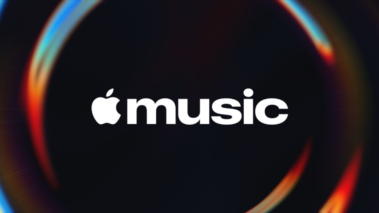
Apple has unveiled a new visual identity for Apple Music, and instead of a flat icon redesign, the centerpiece is a short animated logo that looks like a musical note sitting beneath rippling water. The effect wasn’t created in software: Apple says it etched the logo onto the glass floor of a small tank, filled the tank with mineral oil, covered it, and then played a series of tones through an instrument to physically disturb the oil’s surface before filming the result.
A Practical Effect, Not a Digital Filter
The rippling visuals came out of a collaboration between Apple, music producer Fred Again, and an audio company called NEST Acoustics. According to a narrator in Apple’s introduction video, the goal was to let sound itself create the visuals, essentially trying to “distill” music into “the perfect sound wave” rather than designing a static image and animating it afterward. That approach explains why the logo looks organic rather than like a typical vector animation.
Where You’ll Actually See It
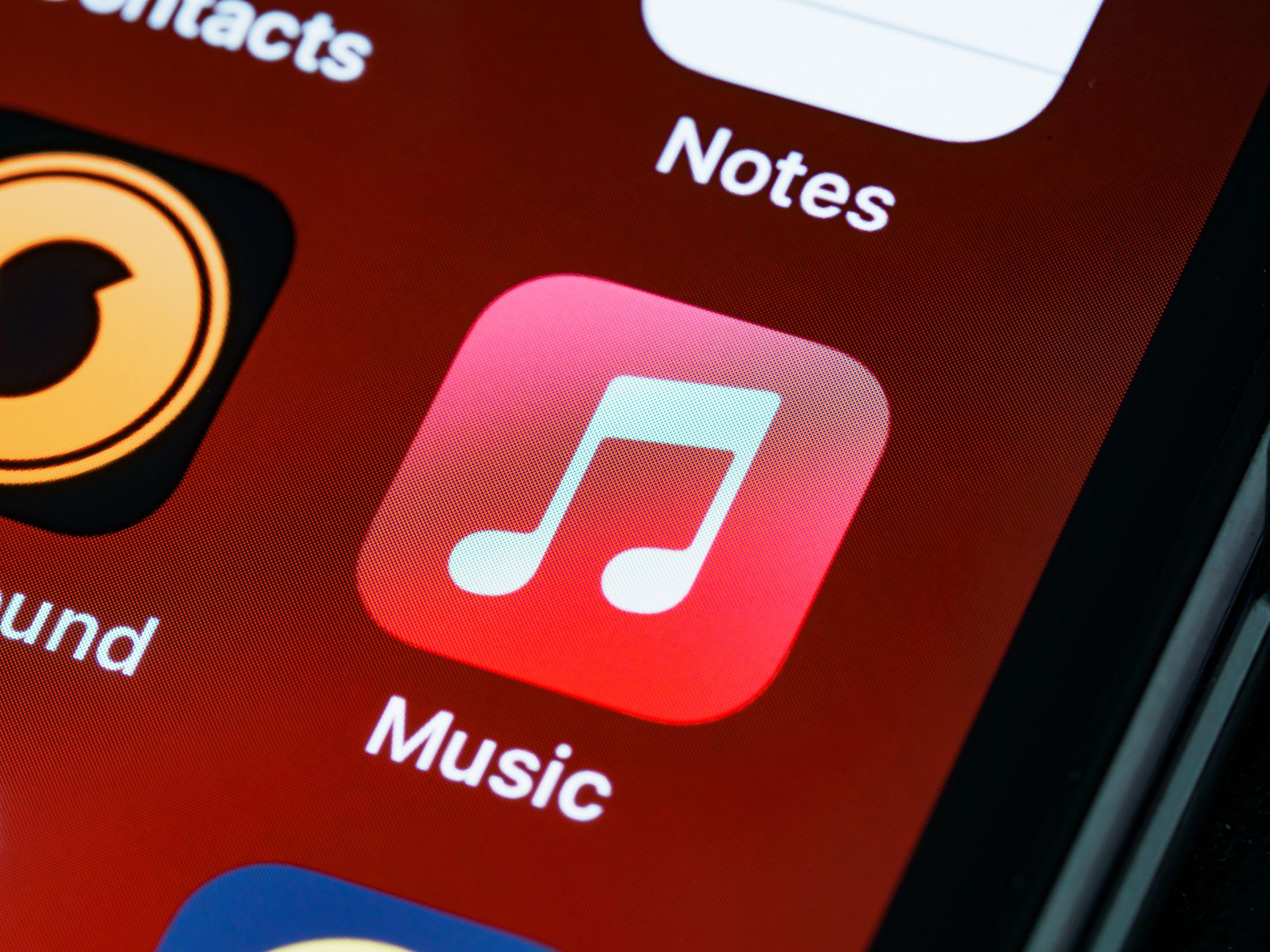
This new rippling logo isn’t replacing the Apple Music app icon on your home screen. Instead, it’s meant to appear as a bumper at the start of Apple Music videos and content like concert footage, similar to how a studio logo might open a film. The app icon itself is getting a separate update, shifting from its familiar red background to a black-and-white look. That change hasn’t been a hit with many people online who are attached to the red branding.
Why the Timing Matters
Both the new rippling intro animation and the reworked app icon are tied to Apple’s upcoming software releases, arriving alongside iOS 27.2 and macOS 27.2. Apple has been leaning into a glassier, more fluid visual language across its software lately, and a logo built from literal liquid motion fits that direction. It’s a small branding move, but it signals that Apple wants its media apps to visually echo the same “Liquid Glass” aesthetic showing up elsewhere in its interfaces.
The Bottom Line
This is a cosmetic change rather than a functional one: no new Apple Music features, pricing changes, or app behavior have been announced alongside it. If you use Apple Music mainly for streaming songs, the practical impact will be limited to seeing a different icon on your home screen and a new animated bumper before video content. Whether you like the black-and-white icon or the rippling water intro is largely a matter of taste.
Source: Engadget